tms x McDonald's Spec Project
Overview
I collaborated with a multidisciplinary team to develop a promotional campaign in quarter four centered on Generation Z and making McDonald's unmissable. I worked closely with creatives, business operations, logistics, and account direction interns to lead the redesign the McDonald's mobile application in alignment with modern and accessible design standards. I presented the redesign to over 200 company representatives including McDonald's executives.
Role
UX Designer
Affiliation
DePaul University, CDM
Areas
Accessibility

Our promotion centered on the idea that generosity in rewarding.
Based on viral pay it forward chains across the nation, we leaned in to the holiday spirit of giving by creating a campaign where a customer can start a chain with just a scan of their app and McDonald's will front the bill. Instead of paying for the next customer's entire order, McDonald's will pay for you to pass back a free medium fry. We call this "Frying It Forward". When a customer Fries It Forward they get a chance at winning exclusive in-app rewards. With every time you fry it forward, you are also donating a portion of your order's cost to the Ronald McDonald Charity.
To support the moments of generosity in our promotional campaign, we redesigned the McDonald's app for Gen Z.
We focused on making the app more personal to the customer and having them feel valued as an app user.
Challenge
The redesign must engage with Gen Z in a modern, accessible, and in a rewards-first manner.

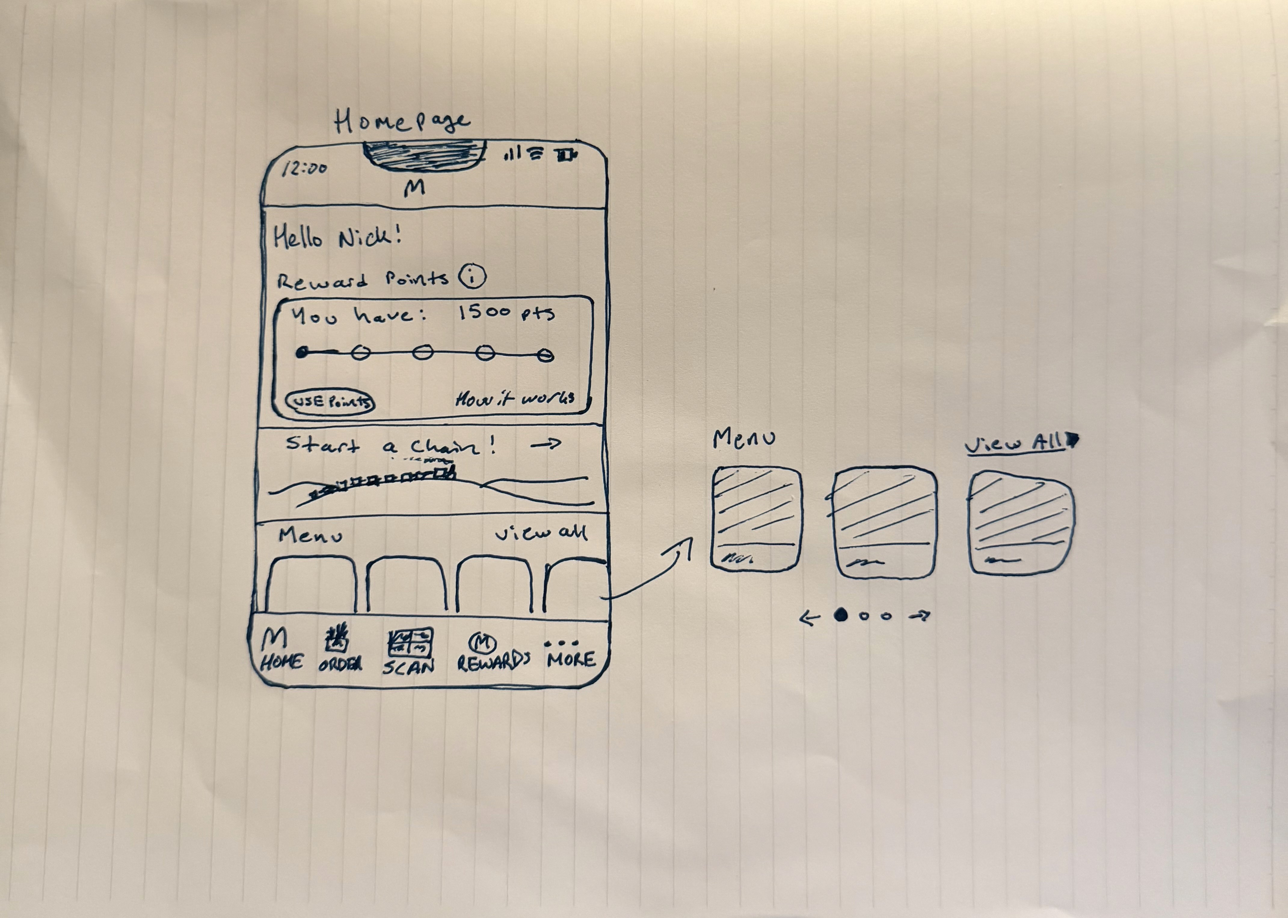
Sketching
We sketched out some of the high traffic pages of the app and focused on our ideas for potential components.
Spacing
We created a spacing system to provide a consistent aesthetic experience across the app.

Typography
The McDonald's text sizes within the app were not legible, often going below 12px. This excludes many people with low vision from having a good experience on the app. We rescaled all the text sizes larger and added a slight letter spacing for enhanced legibility.

Color
The McDonald's color system is not entirely passing WCAG 2.2 and their own enhanced color contrast standards. While adhering to WCAG 2.2 and McDonald's enhanced accessibility guidelines, we developed a simple color system.

Grid
We developed a scalable grid system making it easier to design and keep spacing consistent.

Homepage
Our redesign focused on increasing personalization upon opening the app. This strategy is successful and industry standard in apps across industries. We added a rewards card with a visual and text highlighting how many points the customer has collected. In this reward card, we added a clear "Use Points" call to action (CTA) button. Our intention behind these revisions was to drive customer in-app reward engagement. We wanted to make the customer feel valued as an app user through a personalized experience.

Rewards Page
A main series of design contributions made throughout the app are centered on accessibility. In the original app, text sizes were below standard to the point that a user without any visual impairments would have difficulty reading the content. To fix this, we relied on our enhanced sizes typography system to create a completely legible design. In addition, we remediated the host of color contrast and touch-point box sizing issues. Most significantly, we redesigned the navigation bottom bar with passing color contrasts, touch points, and iconography. Lastly, we added carousel navigation capability for users who cannot rely on swiping. Overall, we accounted mainly for people who have cognitive, vision, and motor impairments.
Presentation
We presented our work to over 200 employees and executives.

