| Internship Projects
Chicago Transit Authority
Information Architecture (IA) Development and App Redesign.
| Overview
This project specifically focused on reorganizing and optimizing the Travel Info and Fares sections of the Chicago Transit Authority (CTA) website. This included enhancing trip planning, route and schedule details, fare and pass information, accessibility features, and other support services. We mapped out the entire site structure to highlight the most relevant content and ensure that all user groups could easily find what they needed.
Transitchicago.com serves as the main website for public transportation riders in the city of Chicago using Chicago Transit Authority (CTA). The Travel Info section serves as a critical resource for users seeking information on how to get from point A to B by providing details on routes, scheduling, alerts, safety, and additional forms of transportation.
Role
UX Researcher & Designer
Affiliation
DePaul University
Areas
Research, Design
Methods
| Testing Strategy
Phase 1
Content Inventory - Developed to identify and describe all content within the webpages
Heuristic Analysis - This analysis identified existing usability issues and guided recommendations.
User Stories - Developed user stories to capture the average experiences and processes for a series of potential users.
Phase 2
Card Sorting - Card sorting tests led to an understanding of how users naturally group transit-related content and allowed for specific IA improvements.
Phase 3
Tree Testing - Tree Testing validated whether users could efficiently navigate the proposed sitemap to find key information.
Phase 1
| Content Inventory & Heuristic Evaluation
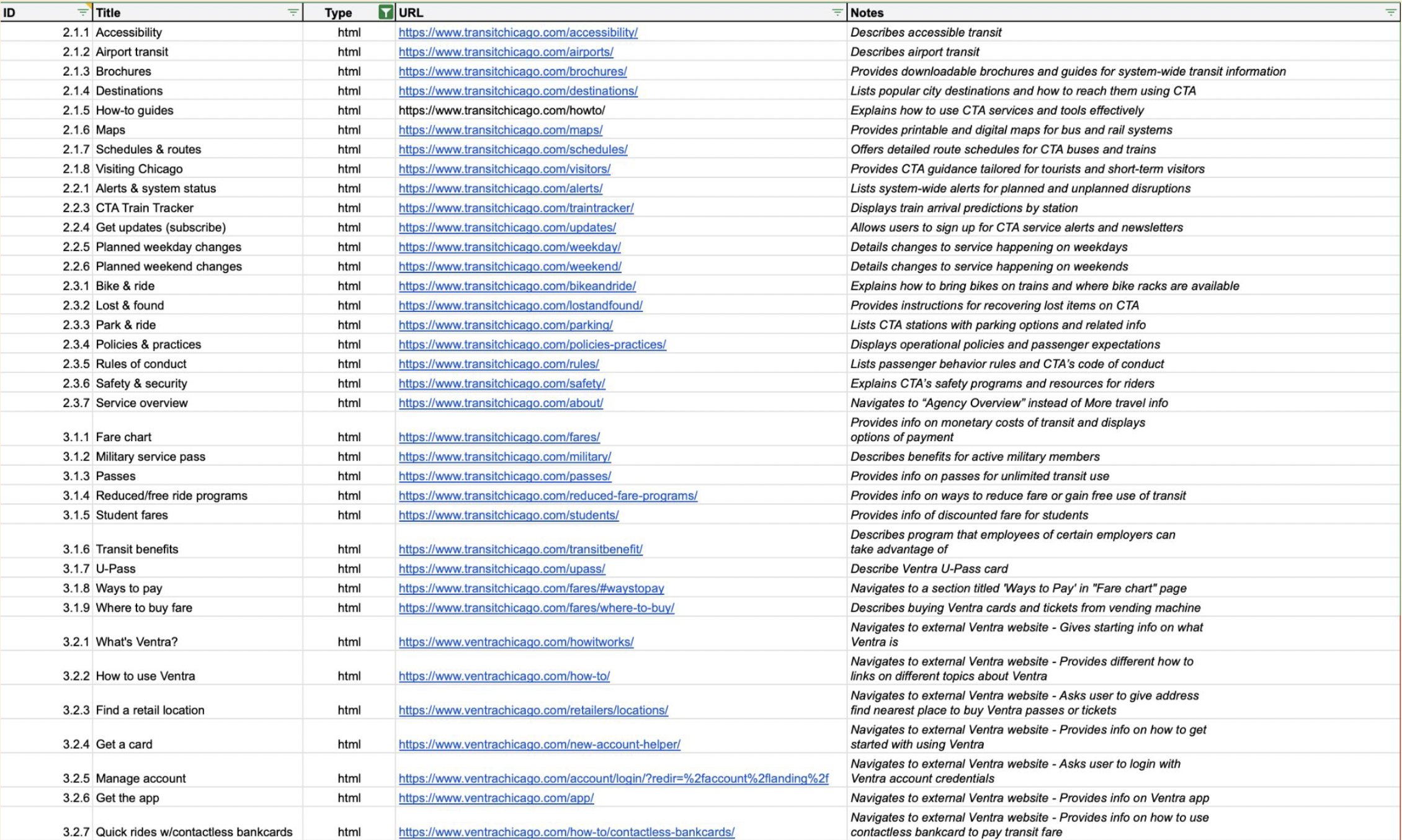
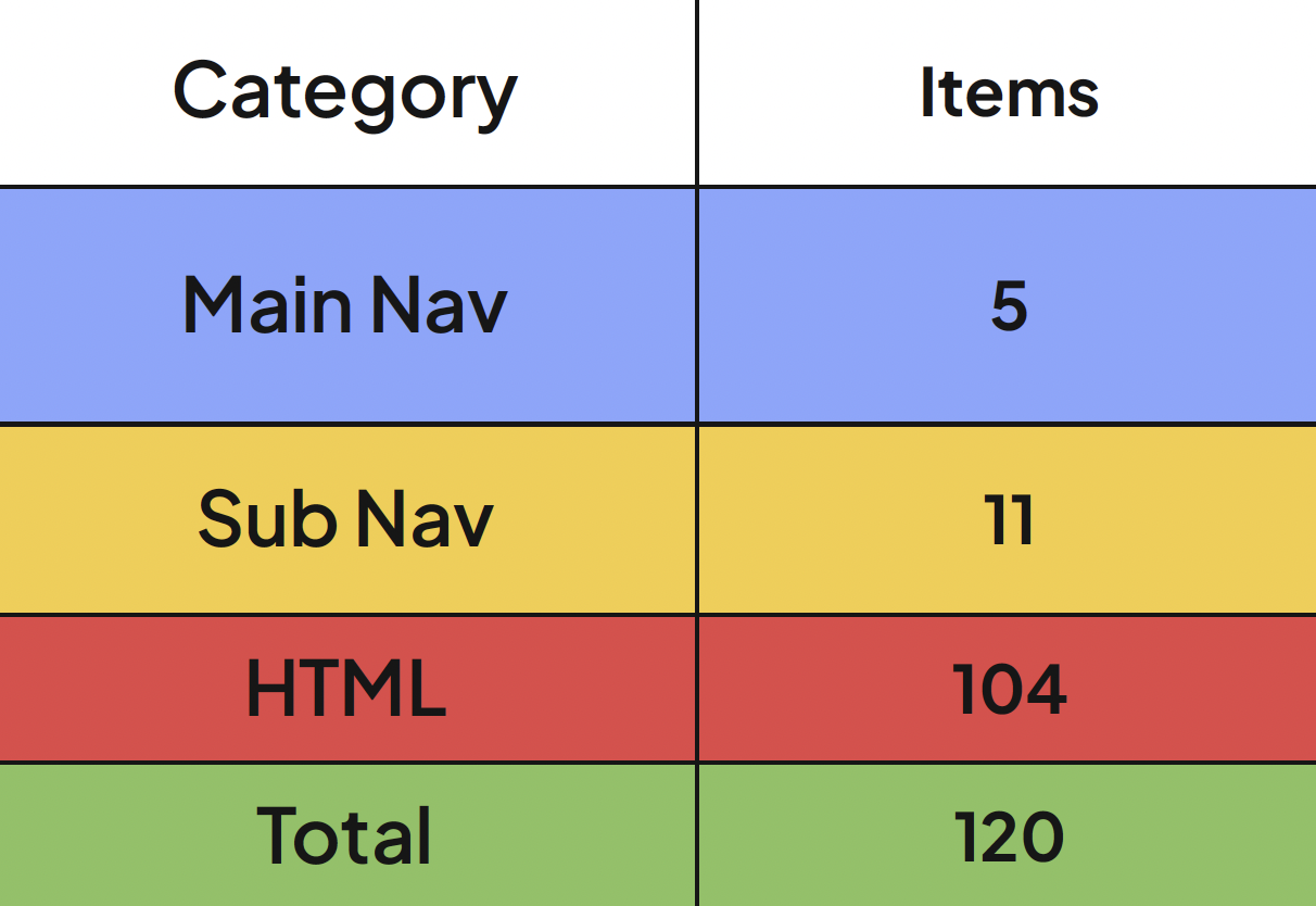
Sorted 120 items into categories.
Identified and described each item.
Found that website uses a topical content strategy, is text heavy, many links redirect to external websites, and the site itself contains information and content not relevant to a person in transit.
Alterations:
Dedicated six items to the top level navigation.
Filtered all HTML items to include only transit relevant information.
Removed items that lead to external transit irrelevant sites.
| User Stories
The Daily Commuter
As a daily commuter, I want to receive real-time updates on train and bus schedules, plan my route quickly, and pay for my fare with minimal hassle, so I can arrive at my workplace or school on time without unexpected delays.
Tourists & Visitors
As a tourist visiting Chicago, I want to find clear and simple guides on how to use public transportation, including translated maps and payment instructions, so I can confidently explore the city without getting lost.
Occasional Travelers
As an occasional traveler, I want to easily find event-specific transit information and plan the best route to my destination, so I can attend events or run errands efficiently without worrying about payment or last-minutes changes.
Cyclists
As a cyclist, I want to see option for storing or transporting my bike when using public transit, as well as access to maps and route planning tools, so I can smoothly integrate cycling and transit in my commute.
Phase 2 - Card Sort
| Pilot
39 Cards
3 Participants residing in Chicago
Improved instructions
Added a “Not Sure” category.
Clarified Card Titles
| Round 1
29 Cards
5 Participants who have never visited Chicago.
Phase 3 - Tree Test
| Pilot
5 Tasks
3 Participants
Changed main navigation wording:
Plan a Trip now is Trip Information
U-Pass is now University Pass
| Round 1
5 Tasks
5 Participants who have never visited Chicago.
| Round 2
38 Cards
10 Participants who use the CTA and reside in Chicago.
| Pilot Tasks
You’re new to using public transportation in Chicago. Where would you go to learn how to use the CTA bus or train?
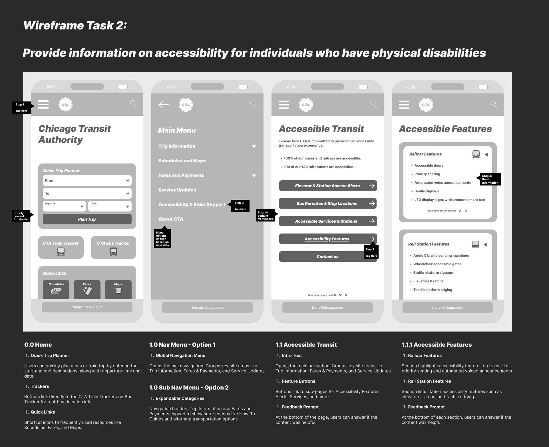
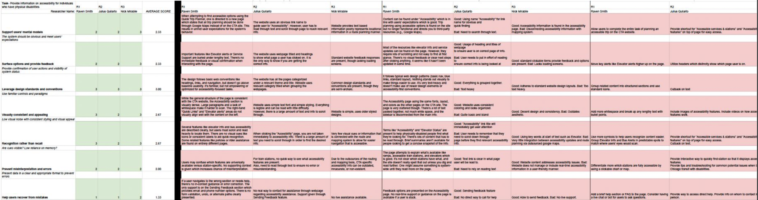
You want to check which accessibility option are available for people with physical disabilities. Using this site, where would you find this information?
You’re trying to find out if you can pay for bus fare using your credit card. Where would you go to locate this information?
You’re planning a trip for this weekend and want to check if there will are any service changes for the CTA Blue line train. Using this site, where would check for information on service changes?
You’re a college student and want to learn more about the U-Pass program. Where would you go to find U-Pass information?
| Round 1 & 2 Tasks
You’re new to using public transportation in Chicago. Where would you go to learn how to use the CTA bus or train?
You have a parent with a physical disability and need to check which train stations have elevators. Using this site, where would you find this information? (NEW)
You’re trying to find out if you can pay for bus fare using your credit card. Where would you go to locate this information?
You’re planning a trip for this Memorial Day weekend and want to check if the CTA Blue line train is running on a holiday schedule. Where would you get this information? (NEW)
You’re a college student and want to learn more about the U-Pass program. Where would you go to find U-Pass information?
| Data Labels
A - Task 1
B - Task 2
C - Task 3
D - Task 4
E - Task 5
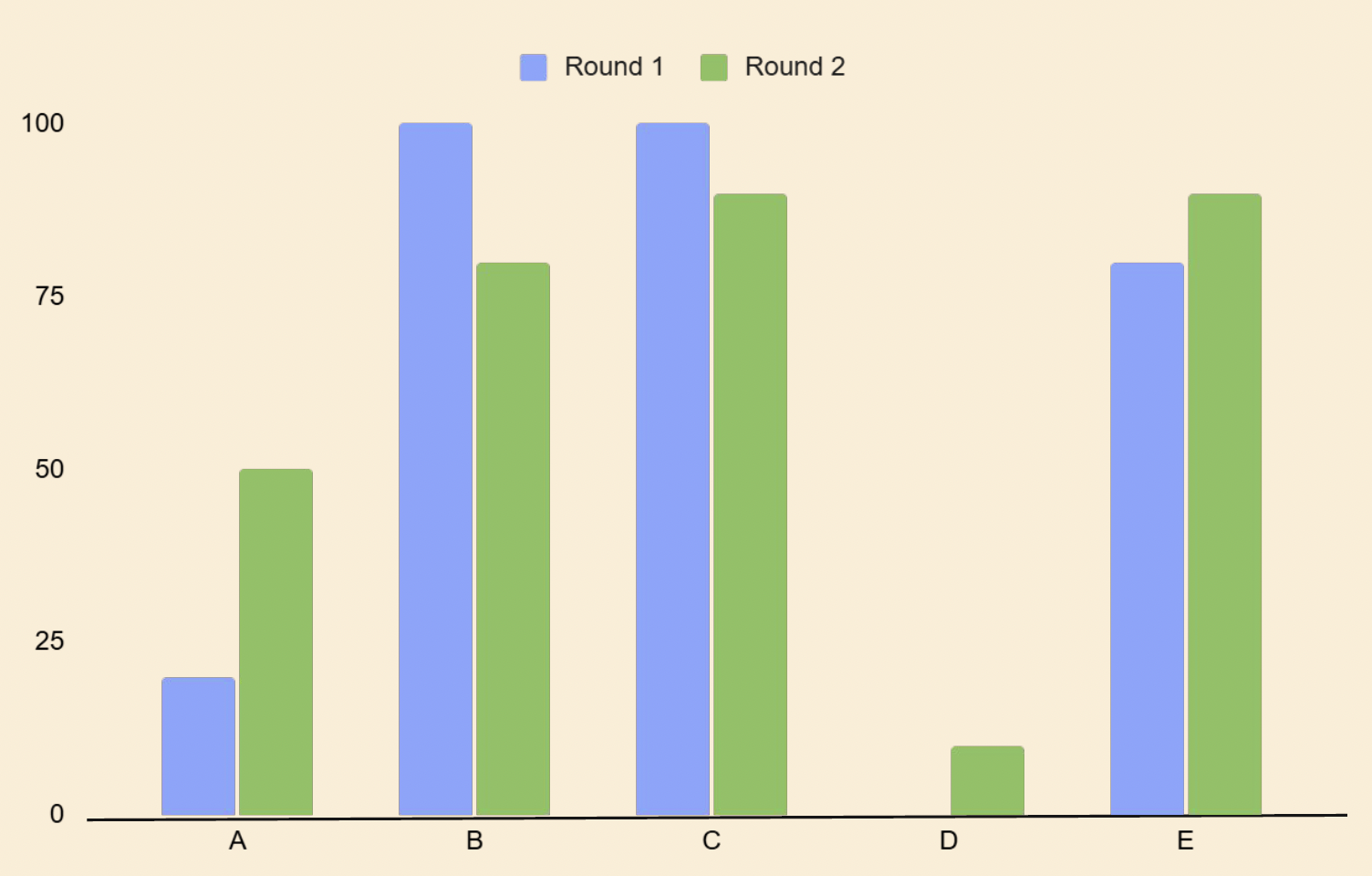
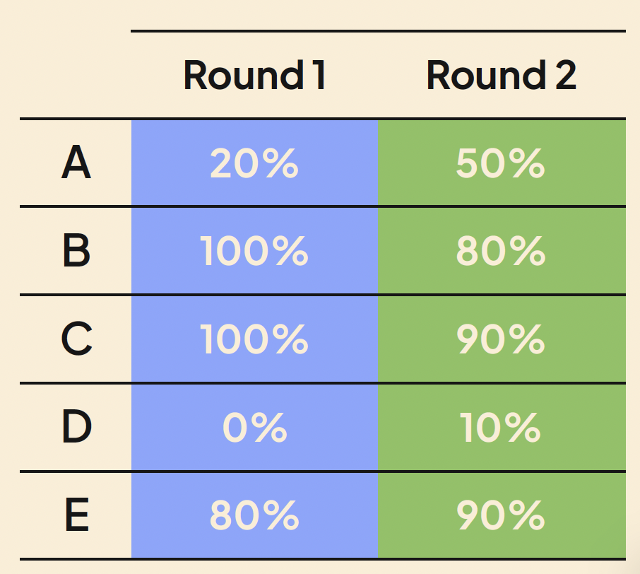
| Findings
Clear navigation labels helped users find information more easily.
Users familiar with the CTA navigated differently than new users, showing the need to support both group.
Information about delays, holiday schedules, and service changes was not obvious and needs clarification.
Larger and more realistic participant pools uncovered gaps in the information architecture that weren’t visible earlier.
| Future Tree Test Insights
We learned that users will first look at keywords when they have a task and are looking for info.
Without keywords immediately present, users will have a hard time and will end up spending lengthy amounts of time searching through the website.
We will need to ensure our navigation items clearly display keywords for the main tasks we would like users to be able to accomplish.
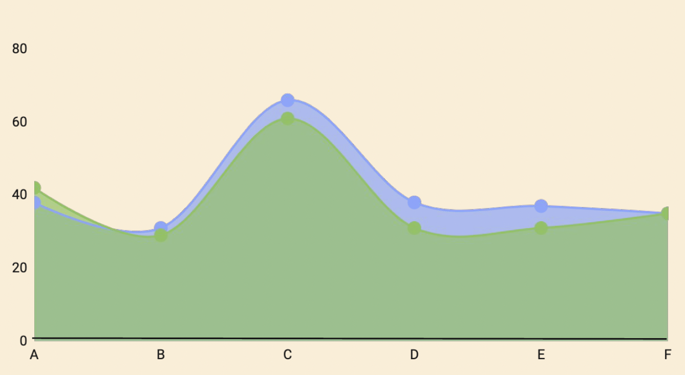
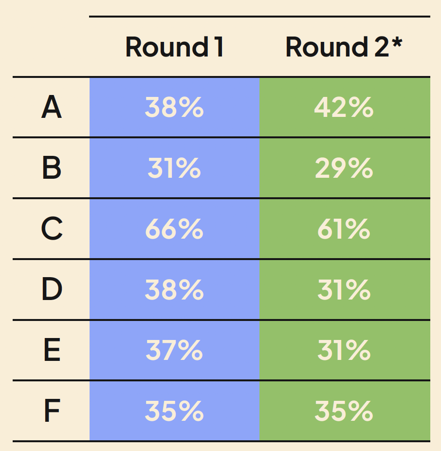
| Data Labels
A - About CTA
B - Accessibility & Rider Support
C - Fares & Payments
D - Plan a trip
E - Schedules & Maps
F - Service Updates
| Findings
Low Agreement Areas:
Accessibility & Rider Support
Plan a Trip
User Confusion:
Results indicate uncertainty over terms such as “Ways to Pass” & “Transit Benefits”
Recommendations
Reevaluate category wording in final tree test.
Provide clear examples in final design.
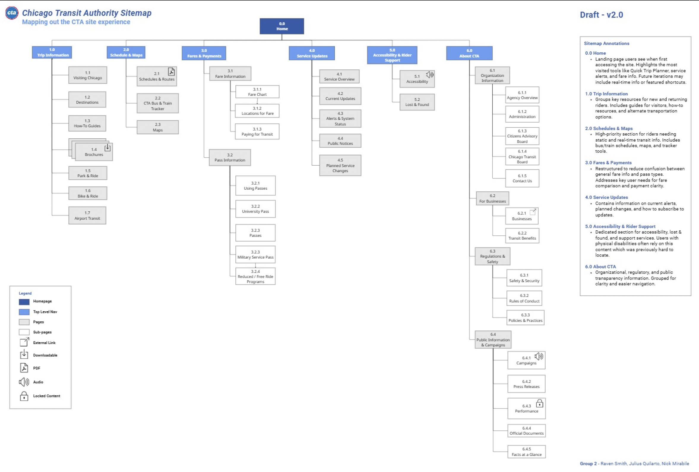
Site Map
| How It Was Made
Content Inventory
Allowed for a visualization and analysis of the entire website. Determined what items to keep and what to filter out for sitemap.
Card Sorting
Grouped website items into different categories. Determined what main navs should be used for sitemap and what items should placed each main nav.
Heuristic Analysis
Determined what standards the website failed and succeeded in reaching. Determined end goals of website and sitemap.
Tree Testing
Tested hypothetical website layout. Used that information to determine layout, what information should appear on sitemap, and how the sitemap should be organized.
Site Map Draft 1
Used Miro board to create the sitemap. Created 6 Top Level Navs, 19 Pages, and 30 Sub-Pages.
Site Map Draft 2
Received feedback indicating mixed navigation should be avoided and that wording should be simplified. Decided on a topical navigation style and to transform sub-pages into pages. Ended up with 6 Top Level Navs, 23 Pages, and 23 Sub-Pages.
Wireframes
| Wireframing based on tasks.